Recognition
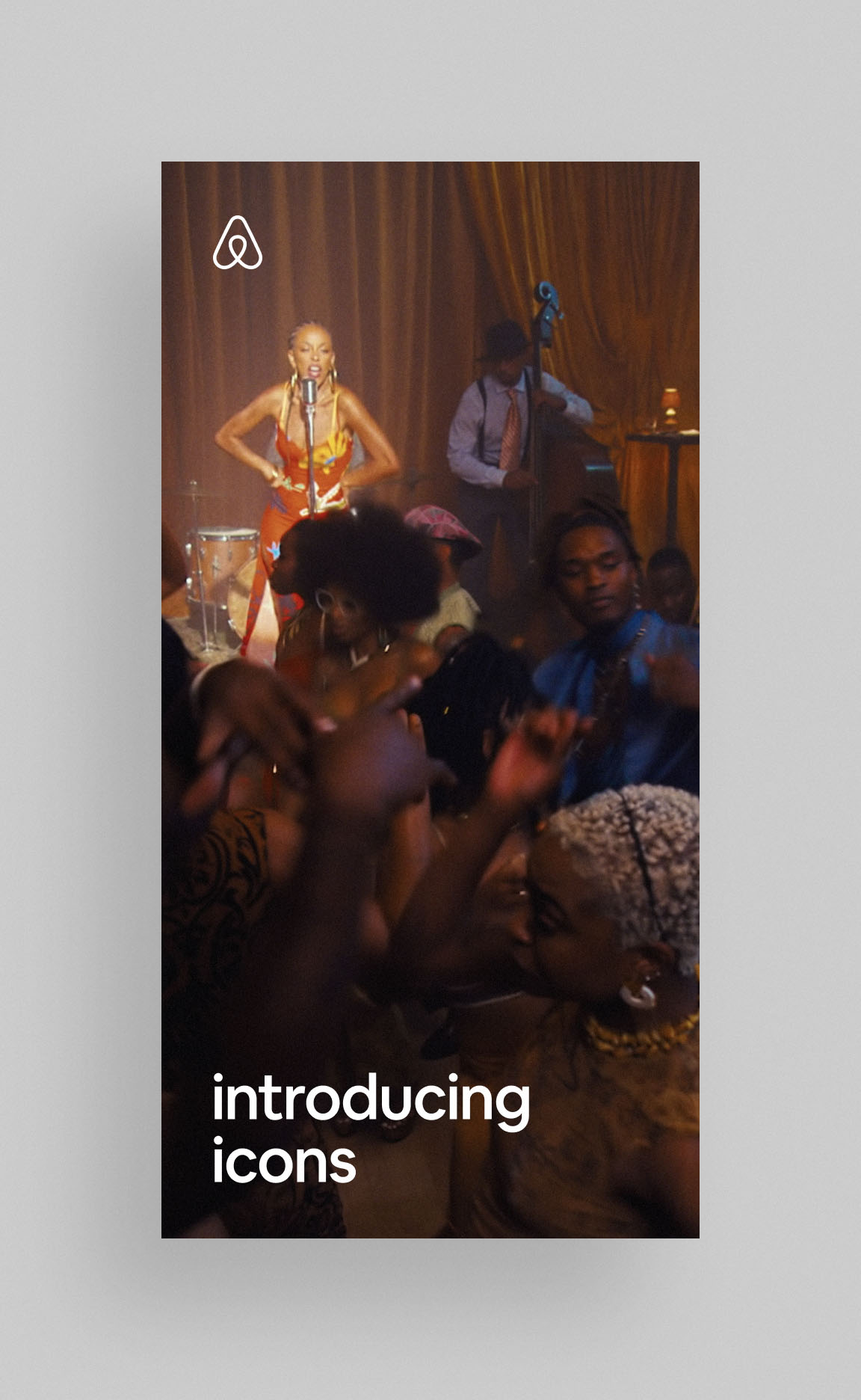
Cannes Lions / Media: Large Scale Media – Bronze / Airbnb Icons
Cannes Lions / Media: Use of Digital Platforms – Bronze / Airbnb Icons
Cannes Lions / PR: Sponsorship & Partnership – Bronze / Airbnb Icons
Cannes Lions / Brand Experience & Activation: Sponsorship & Part. – Bronze / Airbnb Icons
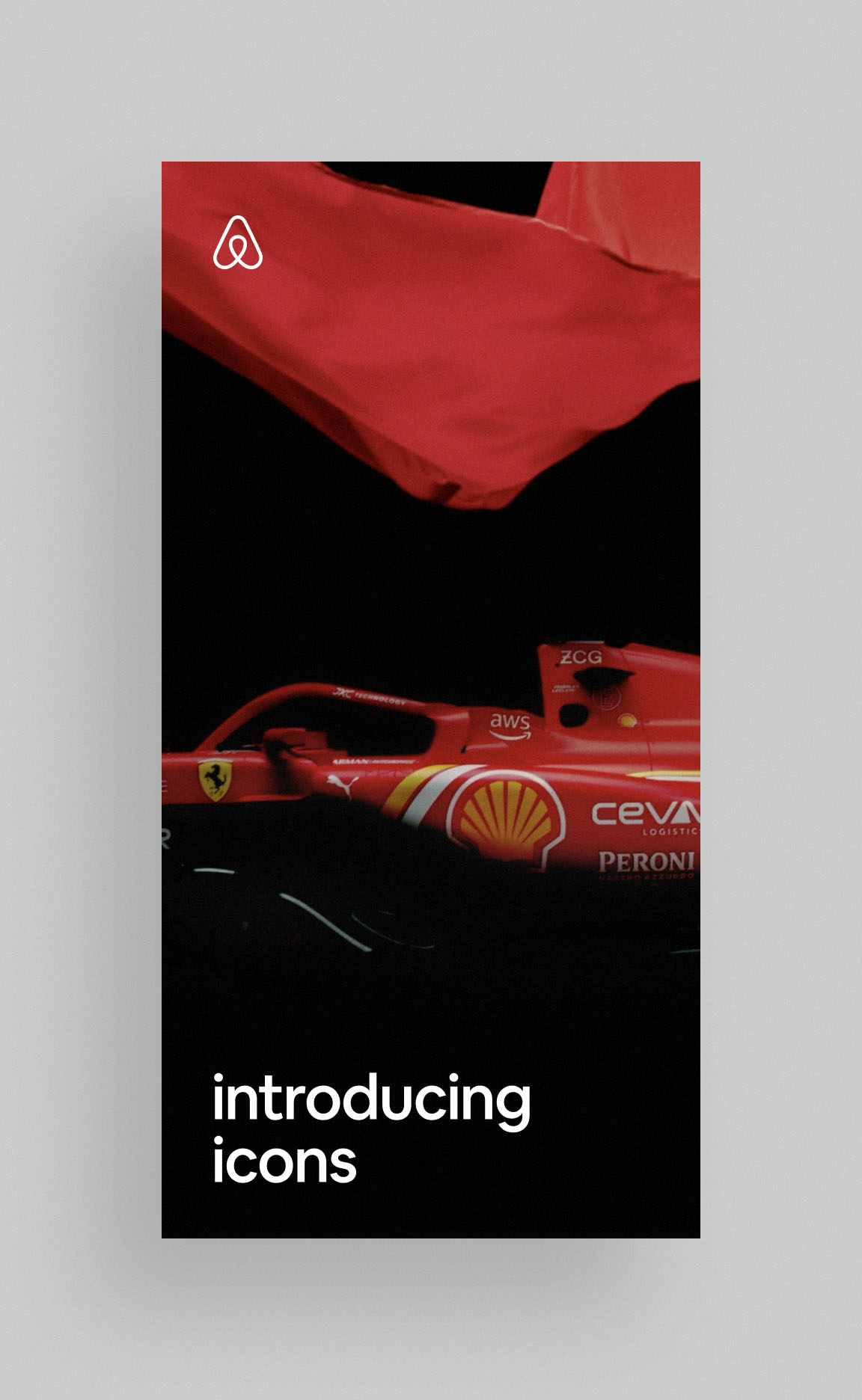
Clio Awards / Creative Effectiveness: Multi-Country – Silver / Airbnb Icons
The One Show / Creative Effectiveness (Travel) – Silver Pencil / Airbnb Icons
The One Show / Integrated – Silver Pencil / Airbnb Icons
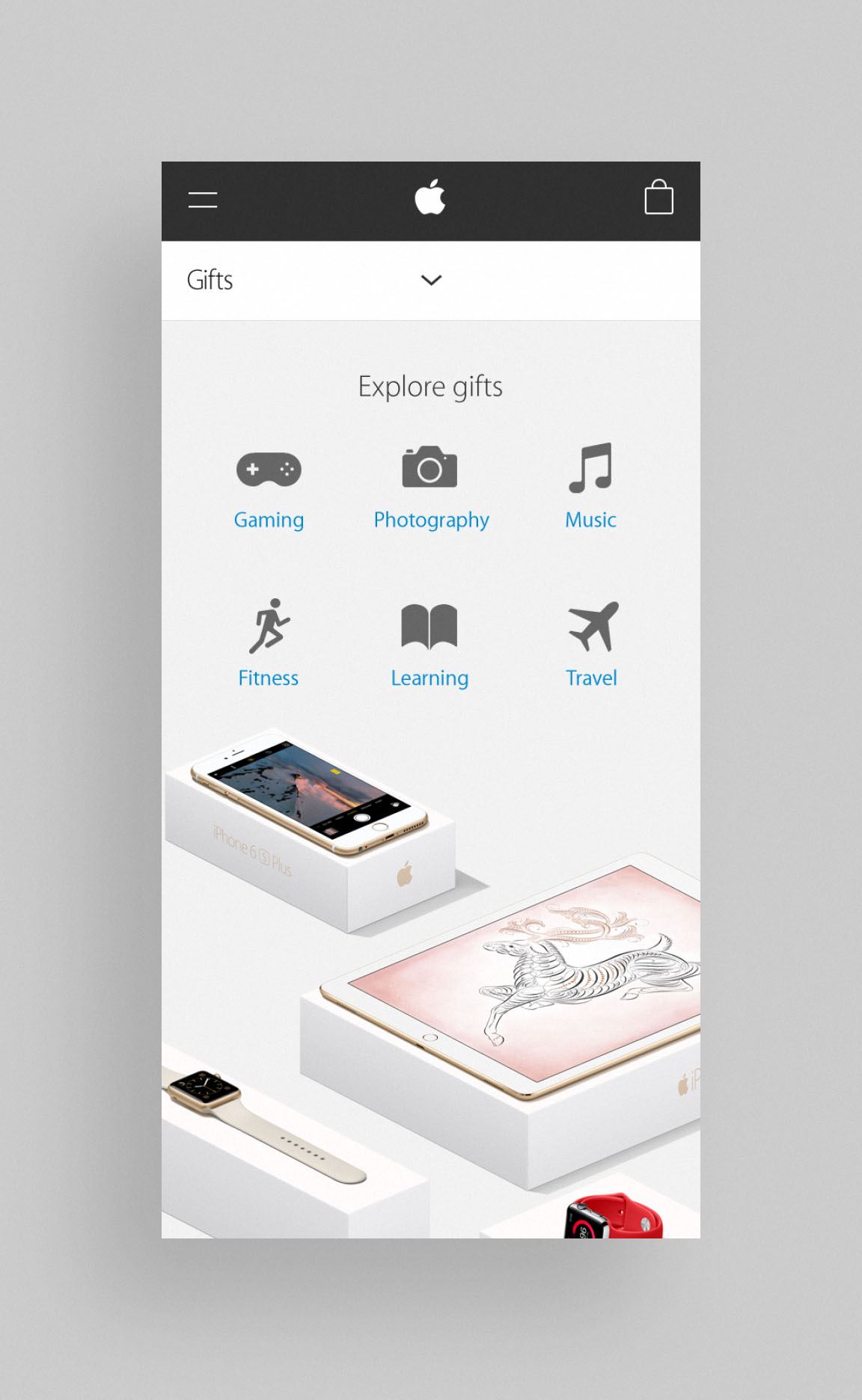
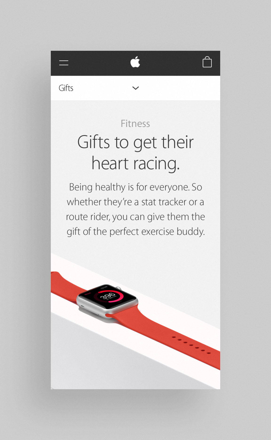
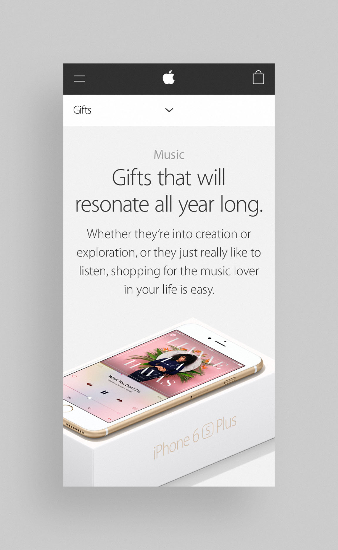
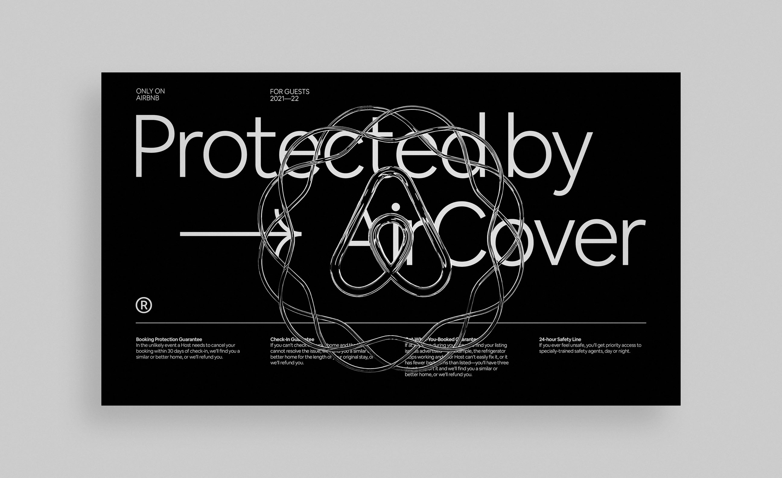
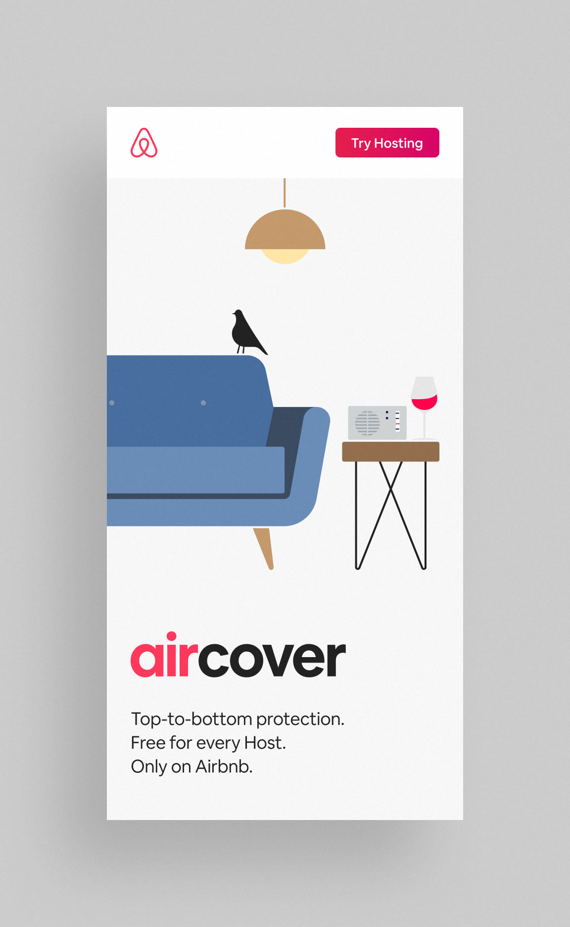
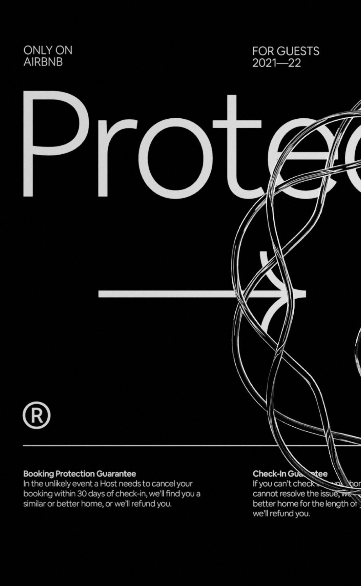
Webby Awards / Winner – Social Travel (Series & Campaigns) / Only On Airbnb
Webby Awards / Honoree – Best Viral PR Campaign / Only On Airbnb
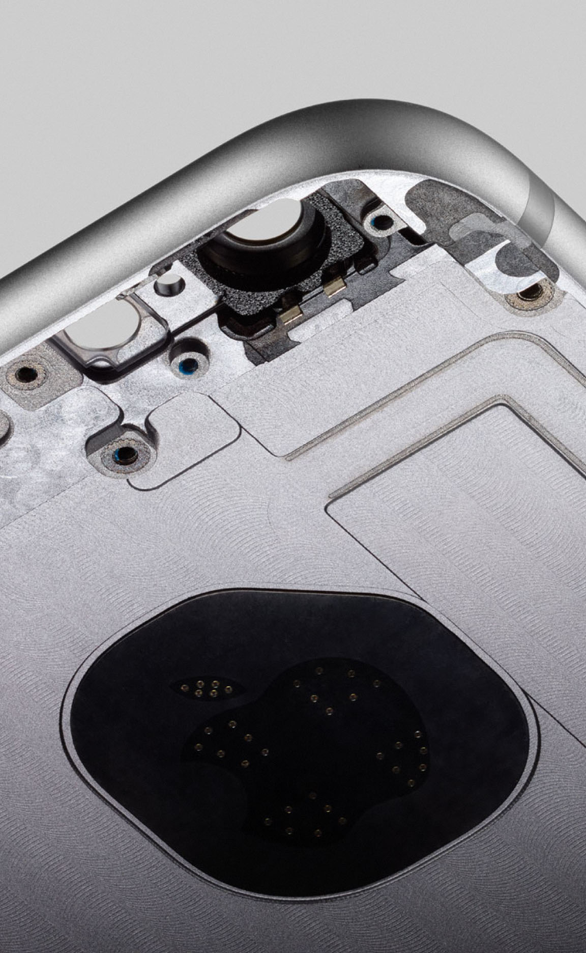
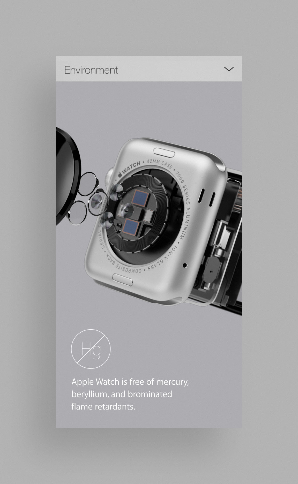
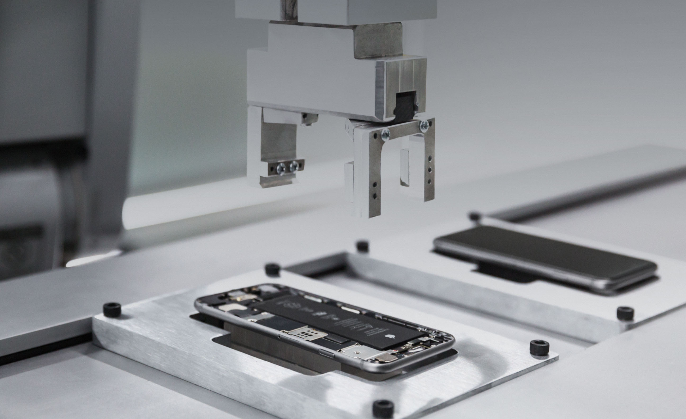
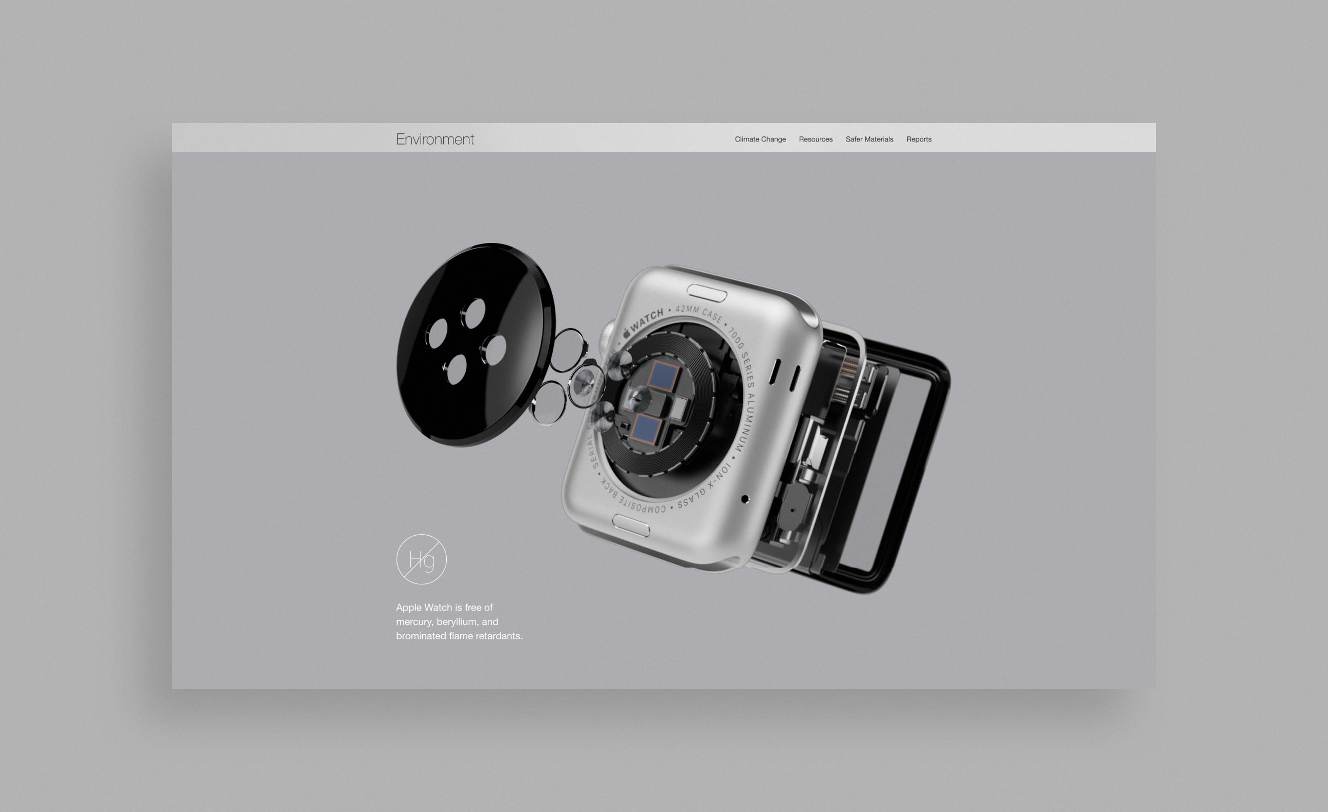
Webby Awards / Honoree – Best Art Direction / Apple “Why There’s Nothing Quite Like iPhone”
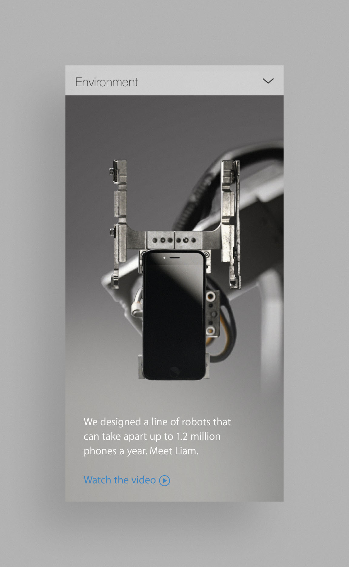
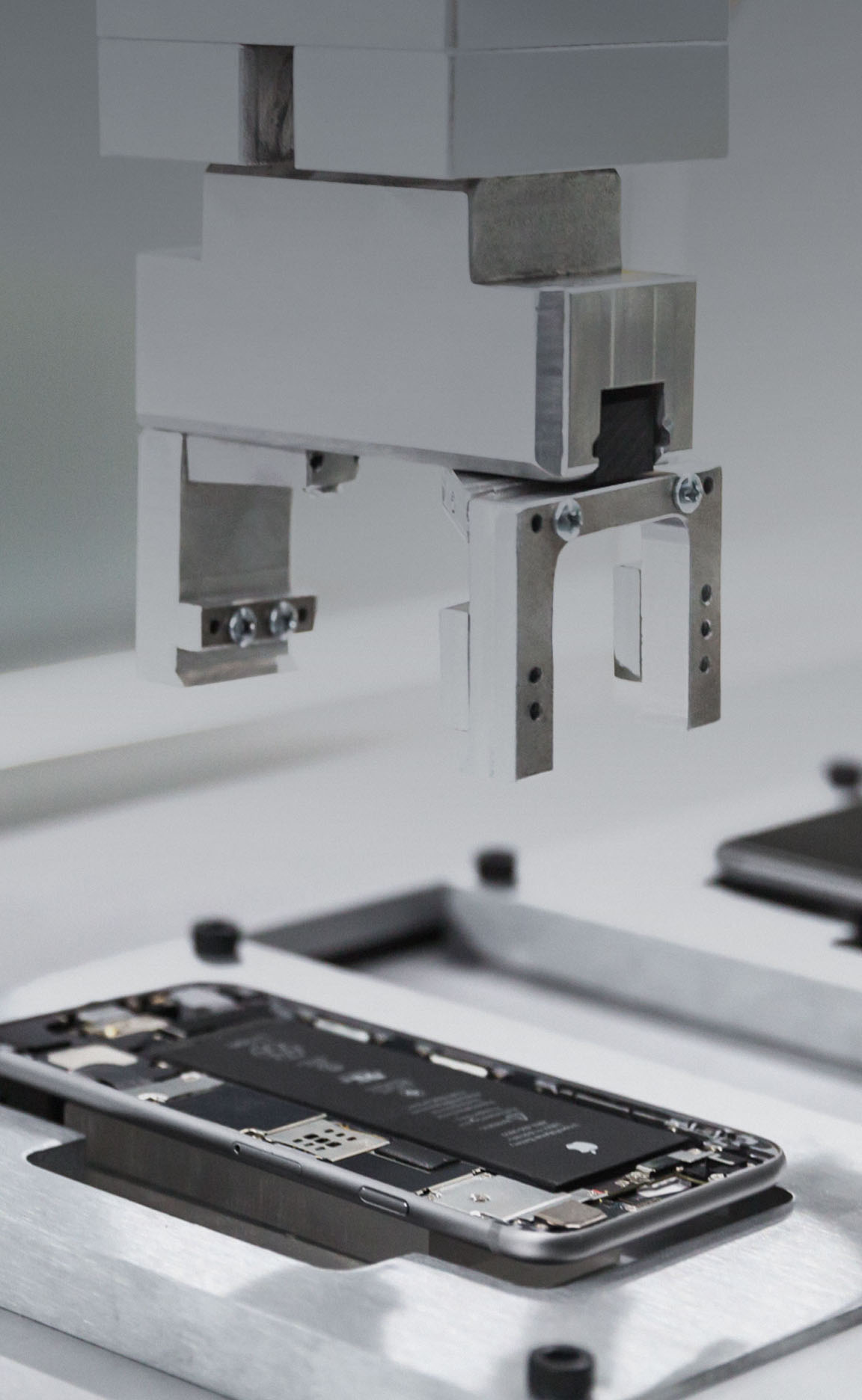
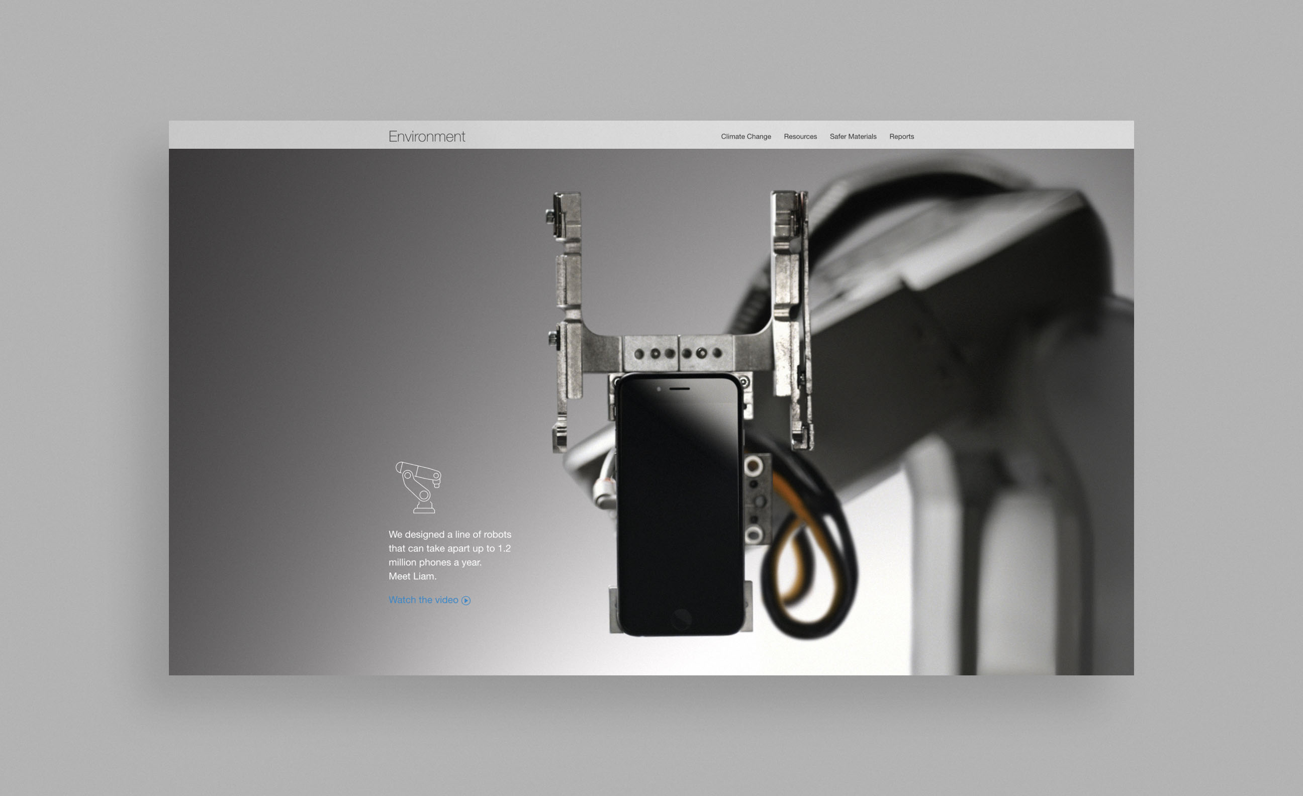
Cannes Lions / Innovation – Bronze / Apple Meet Liam Campaign
Webby Awards / Nominee – Consumer Electronics & Services / iPhone
Webby Awards / Honoree – Technical Achievement / Sound City Project
Cannes Lions / Mobile – Bronze / Rolex Daytona Experience
One Show Interactive / Silver Pencil – UX Craft / Rolex Daytona Experience
SXSW / Best Website for Educational Resources – PSCU Make Your Money Matter Campaign
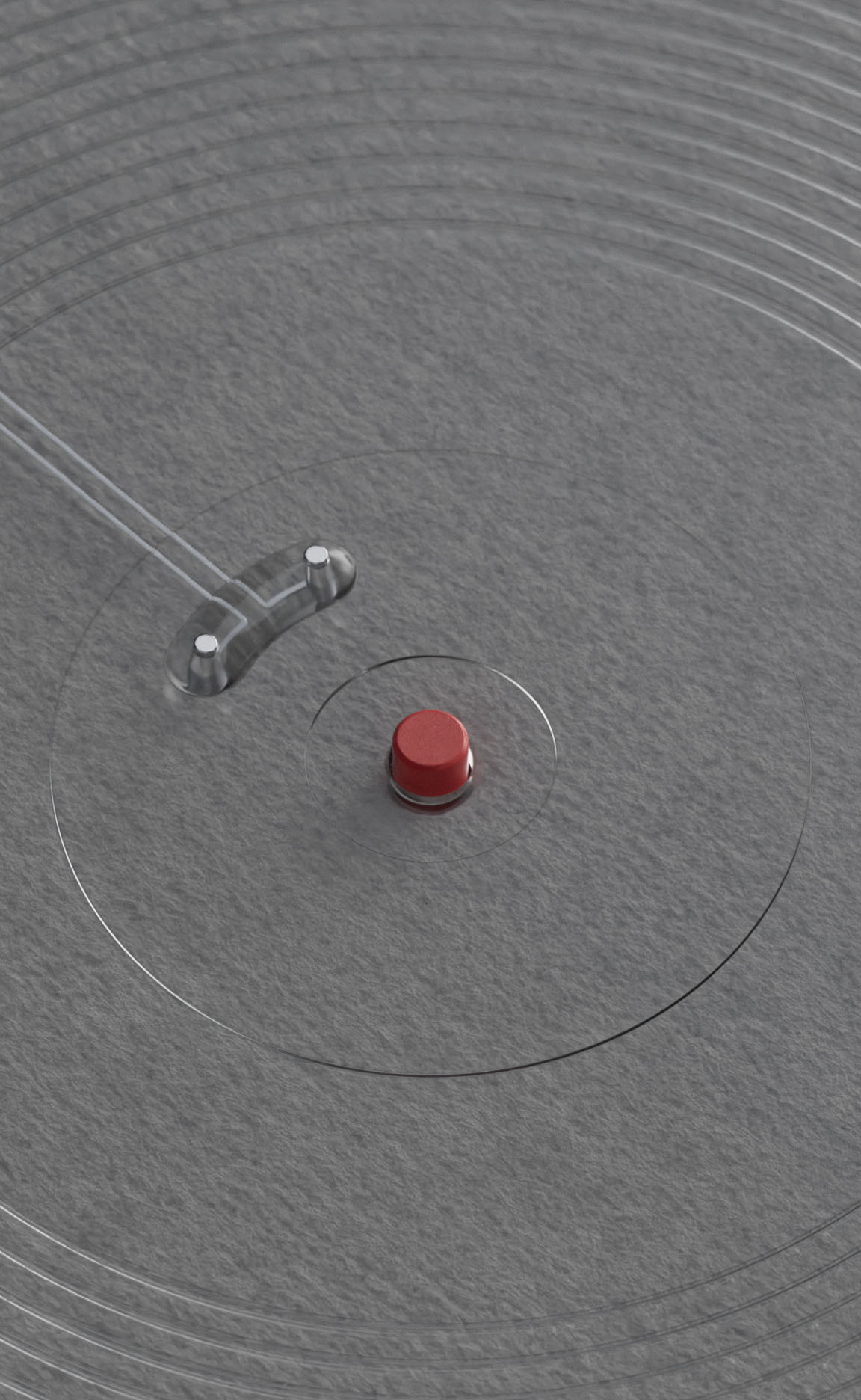
Clio Image Award / Winner – Digital/Mobile / Rolex Daytona
LIA / Silver – Digital Animation / Rolex Daytona Experience Application
Cannes Lions (6x)
Apple, Airbnb, Rolex
The One Show (2x)
Airbnb, Rolex
LIA (1x)
Rolex Daytona Experience
FWA (8x)
Rolex, Metro AR-T, PSCU
Clio Awards (2x)
Airbnb, Rolex
SXSW (2x)
PSCU
Webby Awards (6x)
Airbnb, Apple, Sound City Project
Awwwards (4x)
Sound City Project, PSCU, Sony


